

Site user interface can be customized using Site Admin->Placements->V2 CSS.
Example 1 (Colors)
This example shows how to override the color of various elements
|
/* the background shade color in default CMS generated home page */ .top-demo-header { /* normal state of Success (normally green button) & Primary buttons (normally blue button) */ /* hover state of Success (normally green button) & Primary buttons (normally blue button) */ /* all states of Success button (normally green button) */ /* Icon (font-awesome) color (normally blue) */ /* Icon (font-awesome) color inside button */ |
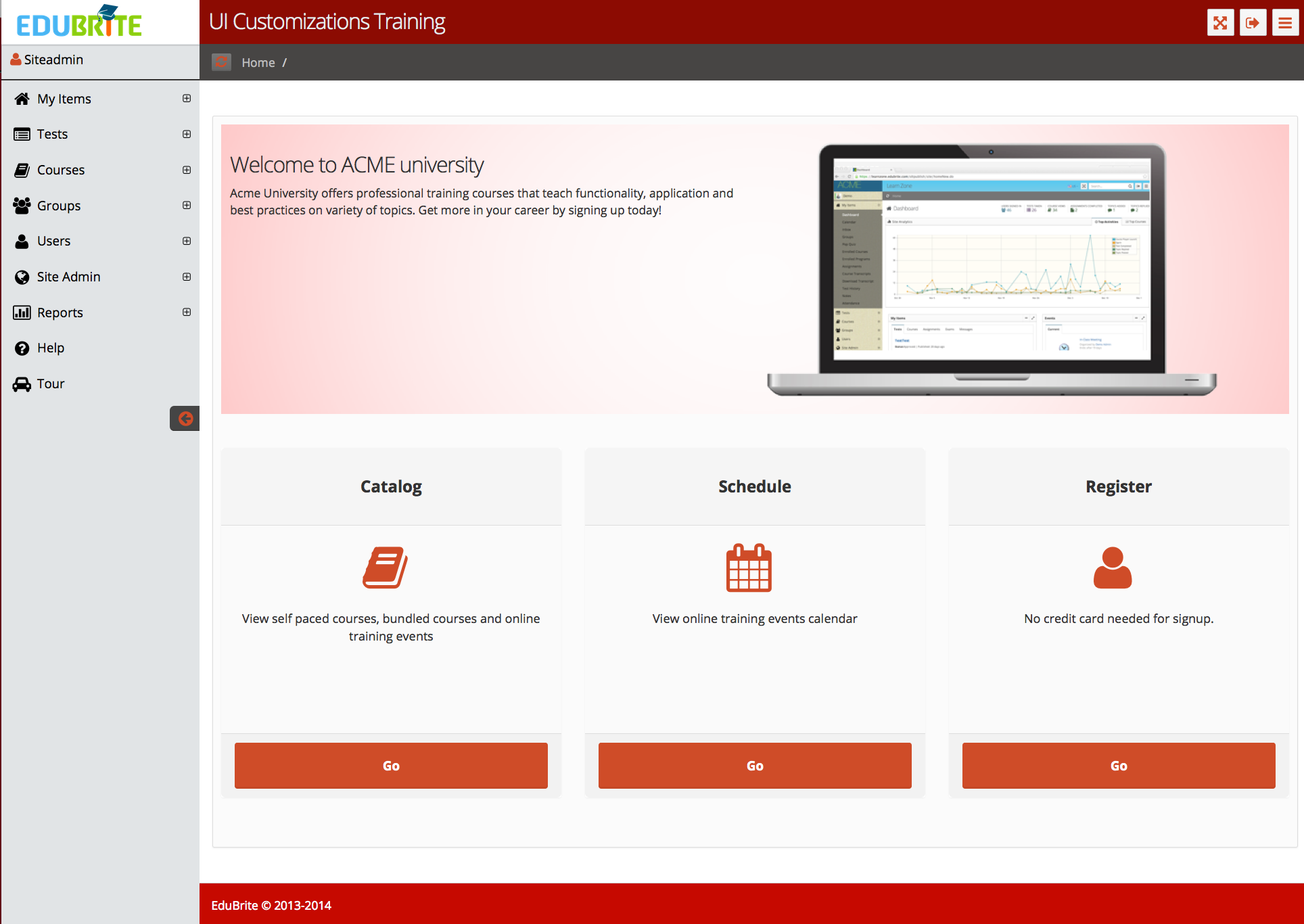
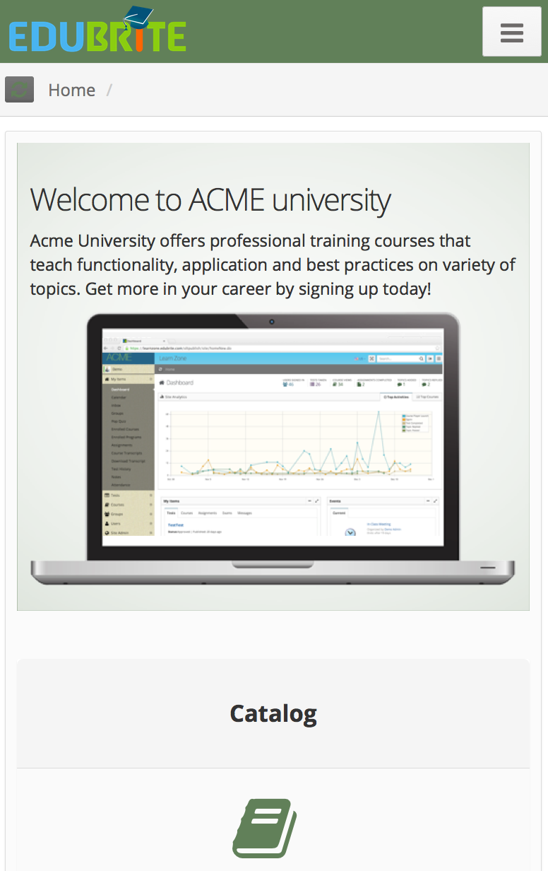
Home Page with Customized Colors
Catalog Page with Customized Colors
Course Player with Customized Colors
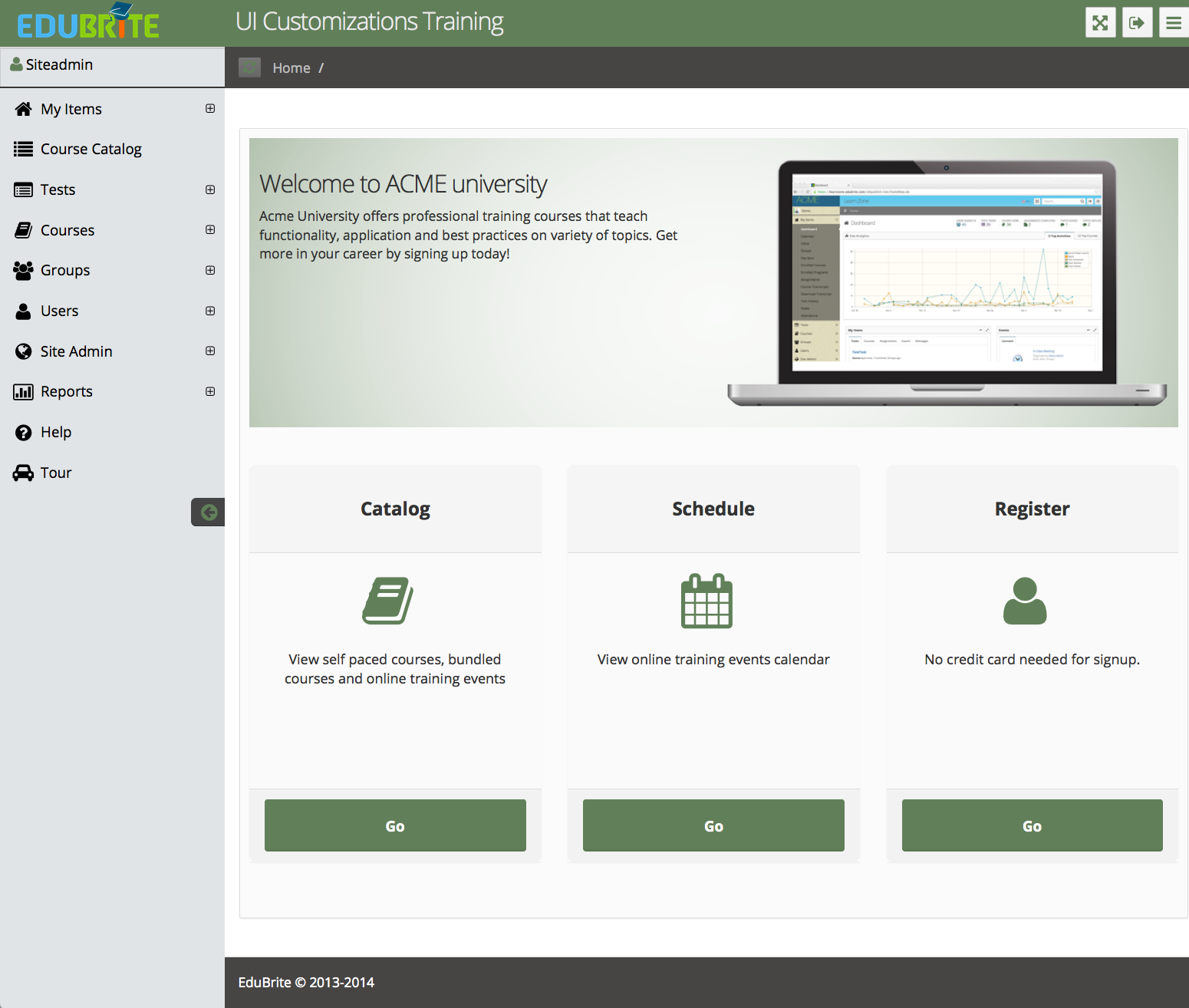
Example 2 (Changing colors to Green)
|
/* Home page default banner background */ .top-demo-header { background: url("/oltpublish/v2/images/teaser-bg.png") repeat scroll center top #618059; } /* Button colors */ .btn-primary, .btn-success{ background-color: #618059; border-color: #618059; } .btn-primary:hover, .btn-success:hover{ background-color: #618059;border-color: #33542A; } .btn-success.active, .btn-success:active, .btn-success:focus, .btn-success:hover, .open .dropdown-toggle.btn-success{ background-color: #618059;border-color: #33542A; } /* Icon colors */ .fa{ color: #618059; } .btn-primary .fa, .btn-success .fa, nav .fa{ color: #ffffff } nav .fa{ color: #000000 } /* Tab colors */ .nav-tabs > li.active > a { box-shadow: 0px -2px 0px #618059; } /* course player colors */ #eb-cp-wrp .panel-body{background-color:#98B590 !important} #eb-cp-header,#eb-cp-footer{background-color:#A0B79A !important; color:#ffffff !important} #eb-cp-footer a{color:#ffffff !important} /* Give same background to Logo and header */ #header, #extr-page #header, #logo-group{background-color:#618059 !important} /* Footer background */ .page-footer{background-color:#474544 !important} |
Example 3 (Header / Logo size)
In this example, we are going to show how to increase the height of header / logo region to accomodate a bigger logo. Also another significant point shown in this example is how to work with varying browser/device widths. E.g. for small screen devices, we would like to keep default header/logo sizes. This is done using CSS media queries.
/* Give same background to Logo and header */ #header, #extr-page #header, #logo-group{background-color:#618059 !important} /* Set logo margin to 0 */ #logo{margin-left:0px} /* For computer screens (width >= 1024 pixels) increase the header height to 160 pixels (change height as per you need) */ @media screen and (min-width: 1024px) { #header , #extr-page #header, #logo-group>span, #header > div { height:160px !important; } #logo img, #extr-page #logo1 img {width:auto !important; height:160px !important} #header{padding:0px !important} #header > div {text-align:center} span#logo, span#logo1{width:100% !important} #left-panel{padding-top:160px} } |
Header with increased height
Header on small screen
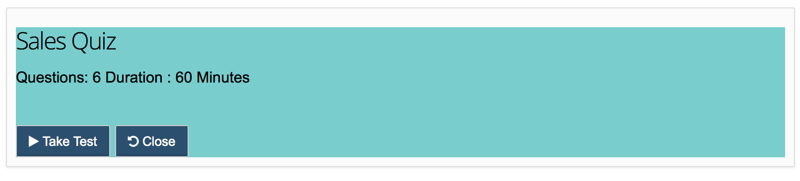
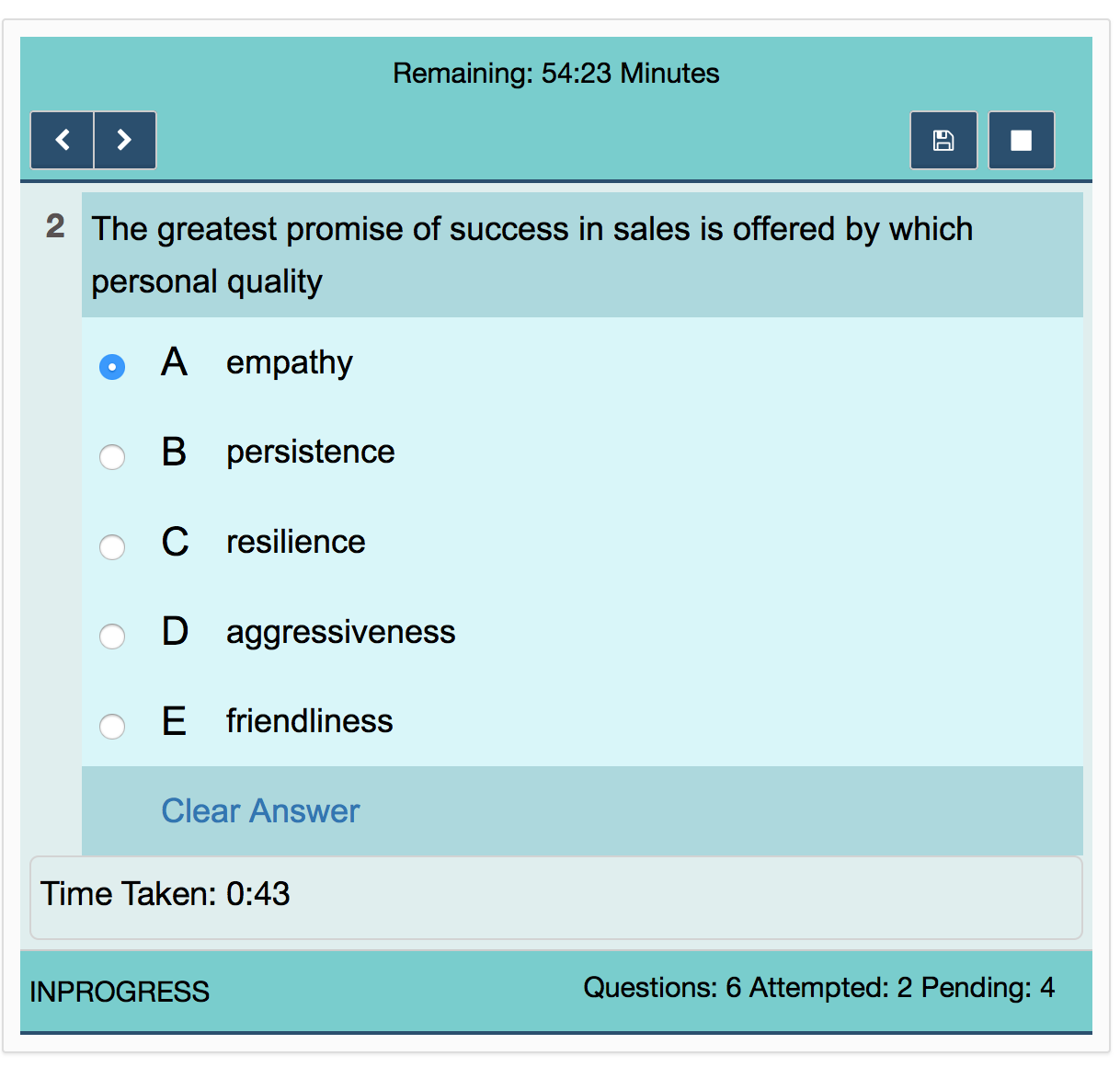
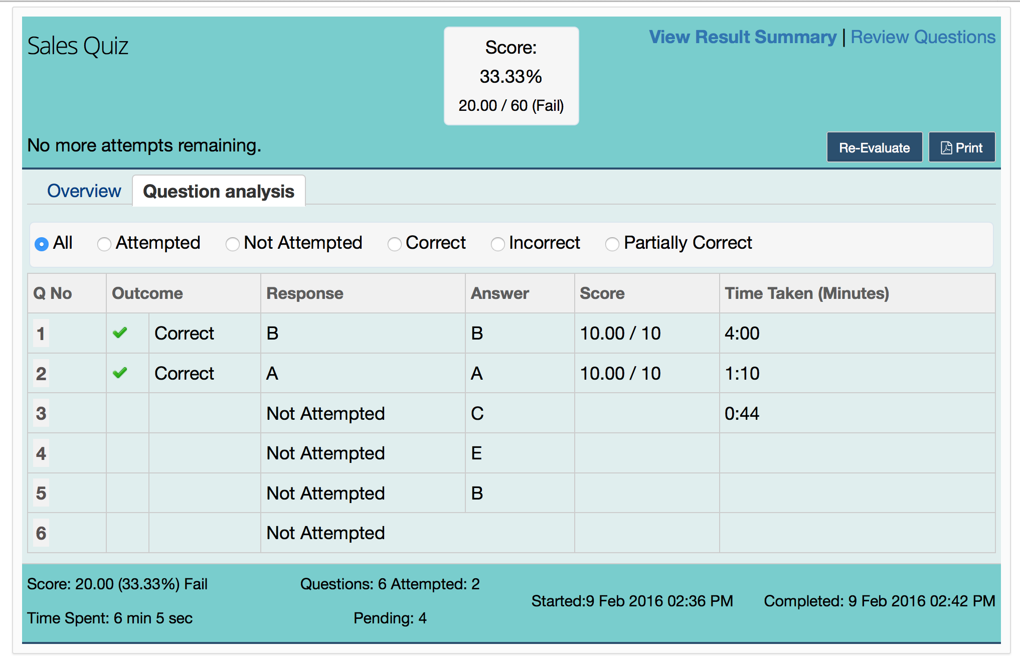
Example 4 (Customizing Test Widget - Background Color, Font)
|
/********** Take Test First Screen **********/
|
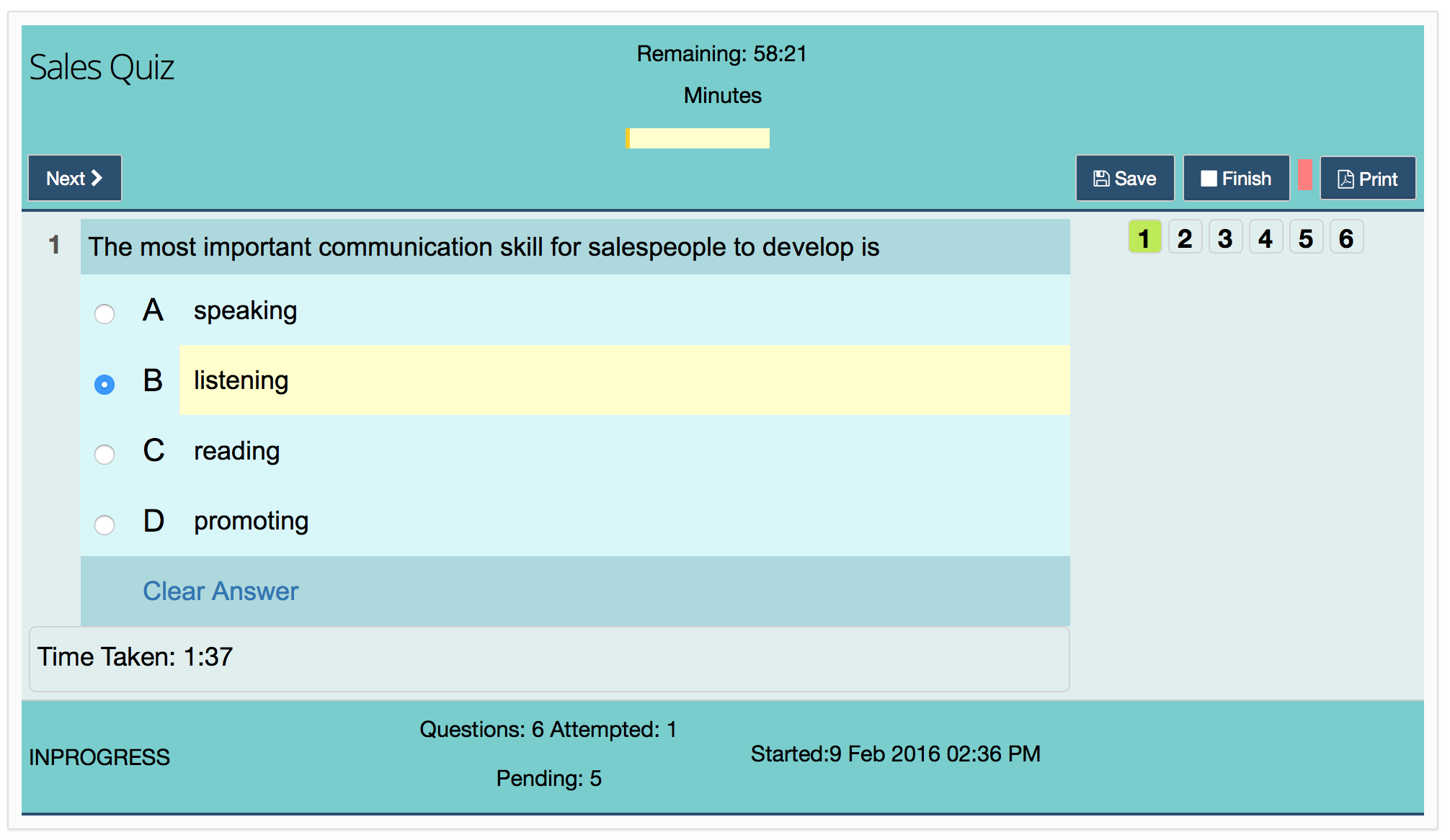
Test Widget on small screen
Test Result Page
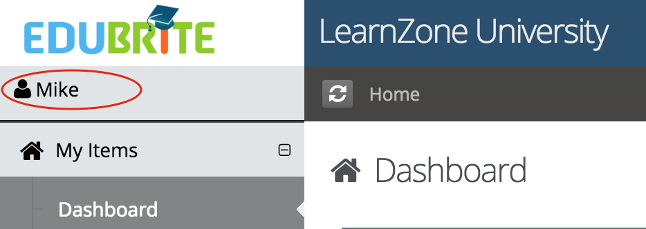
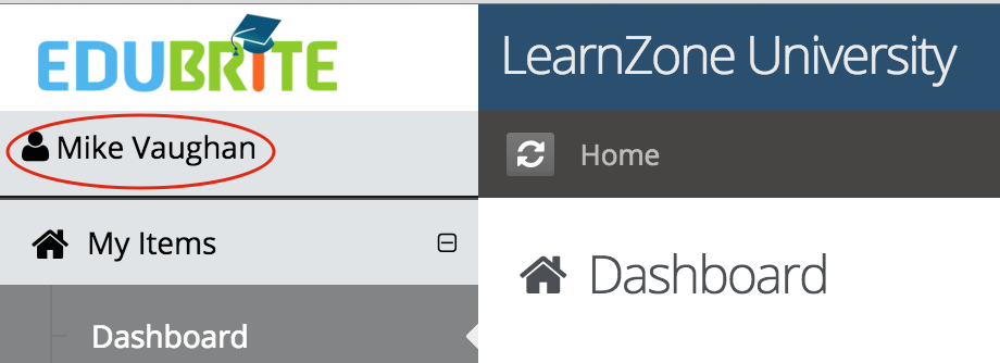
Example 5 (Login Info section - showing user full name)
In login info section by default user's fname is displayed. using css that can be changed to show fullname ( firstaname lastname) or username.
Add below lines in placement - V2 CSS to show user's fullname
/* Show user full name in login-info section */
span.eb-username-prompt-fname {display: none !important; } |
Default view -
Customized view - showing full name
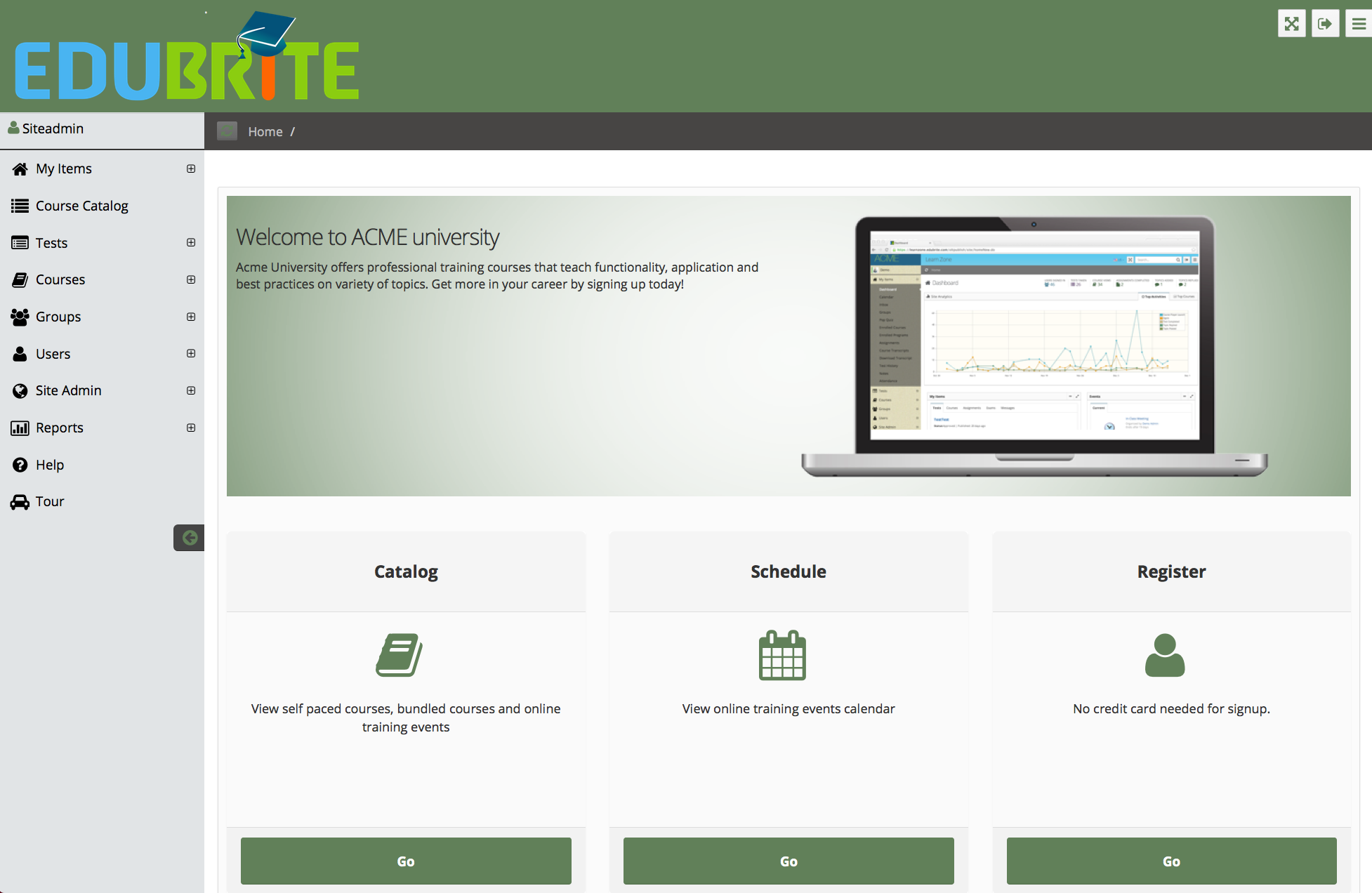
User Interface
- UI Customization
- Customization using Site Placements
- CSS Customizations
- Customizing Date Format
- Customize Sorting
- Customizing Labels (Captions)
- Signup Page Customization
- CMS Overview
- Getting Started with CMS
- Example of using CMS
- Catalog Customization
- Templates
Custom Properties
- Custom User Attributes
- Site level Custom Properties
- Custom property entity specific
- Multiple Languages / Default Language
- Custom File Types (Downloadable files)
Email Customization
- Email Templates Customization
- Email Override
- Email Variables
- Email Scripting - 6 Examples
- Add recommended Courses in completion email
